I spent some of today reading and looking at the new Mendeley (admittedly, I should focus less on the system and more on the papers themselves). The best paper I’ve read so far on workflows as still been from The Fourth Paradigm: Data-Intensive Scientific Discovery, which is available for download online. Then I spent a few hours trying to get python to automatically read a list of a numbers that work as unique identifiers for workflows so that I would be able to automate the querying of the myExperiment database, ending in a small hack and some general annoyance on my part at my own coding skills (again.) I’ve uploaded the small python file I ended up with here; if anyone wants to help me out, I would appreciate. I have instructions for what I had hoped to do with it in the file.
Once that was done, I figured I might as well see if I can get anything at all out of SPARQL after having left it for a few days. I ended up with a few graphs, some of which are interesting.
 Here’s a histogram of the amount of uploads by users. As you can see, the vast majority upload less than five. There’s one outlier – user number 30 (Alan Williams). But this means that it’ll be difficult to judge whether workflows are getting more complex over time – namely, because they aren’t. There isn’t enough time. I hope to be able to query what the average gap is between uploads, or whether scientists normally upload their work all at once and then leave it.
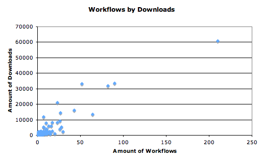
I wasn’t really sure how much myExperiment was actually being used. As opposed to just joined and idly looked about. So, here’s a graph for the amount of downloads against the amount of workflows per user.

This surprised me, to say the least. That’s a lot of workflow downloads. Over 426,000 to be exact. Again, I’m not sure how to do this diachronically, but these are certainly being used. Here’s the same graph but with everyone over 15 workflows cut out.
 So, even those who only upload a couple are being downloaded hundreds of times. Interesting. And it can be seen from this that some users, in general, have more useful workflows than others who upload the same amount.
I’m going to be doing more work tonight trying to grab more data like this offline. We’ve decided to limit the study to Taverna 2, and if there’s time, Taverna 1 and Rapid Miner. A literature review will be done of Kepler. This is being done because there simply isn’t enough workflows to really judge the others. I’m interested in seeing the similarities/differences between T1 and T2 – are they just the same ones, in the new platform? I’m not sure.
